









How to Read Bitcoin Charts – Part 1


Bitcoin charts can look confusing when you are new to crypto.
You open a trading app or exchange, and suddenly you see red and green candles, lines, numbers, volume bars, indicators, timeframes, and strange words like RSI, support, resistance, breakout, moving average, and market structure.
At first, it can feel like you are looking at a secret language.
But once you understand the basics, Bitcoin charts become much easier to read. You do not need to be a professional trader to understand what the market is trying to show you. You only need to learn what each part of the chart means and how to connect the information step by step.
This guide explains how to read Bitcoin charts. It is written for beginners who want to understand price movement, avoid emotional decisions, and make better sense of Bitcoin market behavior.
This is not financial advice. Bitcoin is volatile, and no chart can predict the future with certainty. Charts are tools for understanding probability, not guarantees.
What Is a Bitcoin Chart?
A Bitcoin chart is a visual display of Bitcoin’s price movement over time.
Instead of reading a long list of prices, a chart shows you how Bitcoin moved during a selected period. It helps you see whether the price is rising, falling, moving sideways, or becoming more volatile.
A Bitcoin chart can show you:
- The current BTC price.
- Where price has been in the past.
- How fast price is moving.
- Whether buyers or sellers seem stronger.
- Whether Bitcoin is trending up, trending down, or consolidating.
- Where price may face support or resistance.
Bitcoin charts are commonly found on crypto exchanges, financial websites, portfolio apps, and charting platforms.
Why Bitcoin Charts Matter
Bitcoin is traded globally, 24 hours a day, 7 days a week. Unlike traditional stock markets, the crypto market does not close on weekends or holidays.
That means Bitcoin’s price is always moving.
Charts matter because they help you avoid guessing blindly. Instead of asking, “Is Bitcoin going up or down?” you can start asking better questions:
- What is the trend?
- Is price near a major support level?
- Is volume increasing or decreasing?
- Is the market overextended?
- Are buyers still strong?
- Are sellers taking control?
- Is this move real or just short-term noise?
For beginners, the goal is not to become a perfect trader. The goal is to understand what you are looking at before making decisions.
The Main Parts of a Bitcoin Chart
Before reading a Bitcoin chart, you need to understand its main parts.
Most Bitcoin charts include:
- Price axis.
- Time axis.
- Candles or lines.
- Volume bars.
- Timeframe selector.
- Indicators.
- Trading pair.
Let us break them down.
1. The Price Axis
The price axis usually appears on the right side of the chart.
It shows Bitcoin’s price in a selected currency, such as:
- BTC/USD.
- BTC/USDT.
- BTC/EUR.
- BTC/KES.
If you are looking at BTC/USDT, the chart shows the price of one Bitcoin compared to Tether, a dollar-pegged stablecoin.
For example, if BTC/USDT is at 68,000, it means one Bitcoin is trading around 68,000 USDT.
The price axis helps you see how high or low Bitcoin has moved.
2. The Time Axis
The time axis usually appears at the bottom of the chart.
It shows when the price movement happened.
Depending on your selected timeframe, the time axis may show:
- Minutes.
- Hours.
- Days.
- Weeks.
- Months.
- Years.
This helps you understand whether you are looking at a short-term move or a long-term trend.
A move that looks huge on a 5-minute chart may look very small on a weekly chart.
That is one of the most important lessons for beginners.
3. The Trading Pair
A trading pair shows what Bitcoin is being compared against.
Common Bitcoin trading pairs include:
- BTC/USD.
- BTC/USDT.
- BTC/EUR.
- BTC/ETH.
- BTC/KES.
If you are viewing BTC/USD, you are looking at the value of Bitcoin in US dollars.
If you are viewing BTC/ETH, you are looking at Bitcoin’s value compared to Ethereum.
Beginners should usually start with BTC/USD or BTC/USDT because they are easier to understand.
4. The Chart Type
Bitcoin charts can appear in different styles.
The most common chart types are:
- Line charts.
- Candlestick charts.
- Bar charts.
- Heikin Ashi charts.
- Renko charts.
For beginners, the most important ones are line charts and candlestick charts.
What Is a Line Chart?

A line chart is the simplest type of Bitcoin chart.
It connects closing prices over time using a single line.
For example, if Bitcoin closed at:
- $60,000 on Monday.
- $61,500 on Tuesday.
- $59,800 on Wednesday.
- $63,000 on Thursday.
The line chart connects those closing prices and shows the general movement.
Line charts are useful because they are clean and easy to understand.
They help beginners see the big picture without too much detail.
However, line charts do not show everything. They usually do not show the opening price, highest price, or lowest price within each period.
That is why many traders prefer candlestick charts.
What Is a Bitcoin Candlestick Chart?
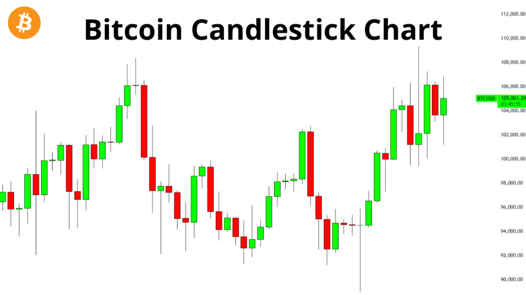
A candlestick chart is one of the most popular ways to read Bitcoin price movement.
Each candle shows what happened to Bitcoin’s price during a specific period.
For example:
- On a 1-hour chart, each candle shows 1 hour of price action.
- On a daily chart, each candle shows 1 day of price action.
- On a weekly chart, each candle shows 1 week of price action.
Candlestick charts are widely used in technical analysis because they show more detail than line charts. They help traders see price direction, volatility, buying pressure, and selling pressure.
The Four Main Parts of a Candlestick
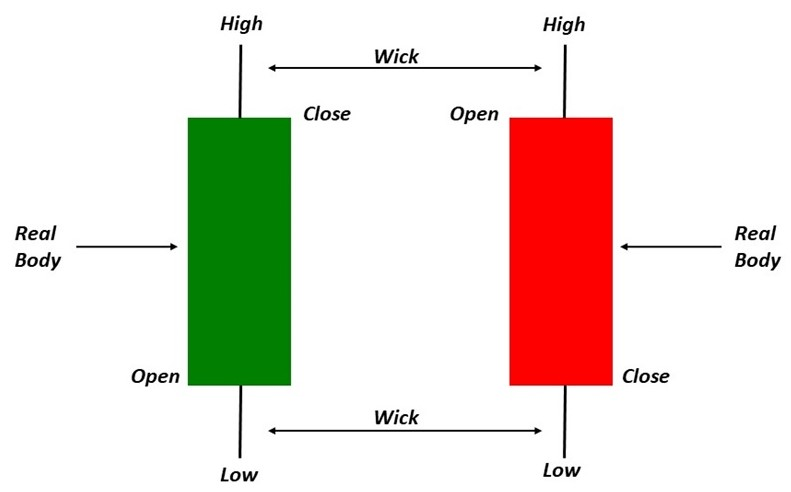
Every Bitcoin candlestick has four important price points:
- Open.
- High.
- Low.
- Close.
These are often called OHLC.
Open
The open is the price where Bitcoin started during that candle’s timeframe.
If you are looking at a daily candle, the open is the Bitcoin price at the start of that day.
High
The high is the highest price Bitcoin reached during that candle.
Low
The low is the lowest price Bitcoin reached during that candle.
Close
The close is the final price of Bitcoin at the end of that candle’s timeframe.
Many traders pay close attention to the closing price because it shows where the market finally settled during that period.
Green Candles and Red Candles
Most Bitcoin charts use green and red candles.
A green candle means Bitcoin closed higher than it opened.
A red candle means Bitcoin closed lower than it opened.
Simple meaning:
- Green candle = price went up during that period.
- Red candle = price went down during that period.
However, one candle alone does not tell the full story. You must look at the candles around it, the trend, and the volume.
The Candle Body
The body is the thick part of the candle.
It shows the distance between the open and close.
A long body means the price moved strongly in one direction.
A short body means the price did not move much between the open and close.
For example:
- A long green body shows strong buying pressure.
- A long red body shows strong selling pressure.
A small body shows uncertainty or balance between buyers and sellers.
The Candle Wick
The wick is the thin line above or below the candle body.
It is also called a shadow.
The upper wick shows how high price moved before pulling back.
The lower wick shows how low price moved before bouncing back.
Wicks are important because they show rejection.
For example:
- A long lower wick can mean sellers pushed price down, but buyers stepped in and pushed it back up.
- A long upper wick can mean buyers pushed price up, but sellers rejected the move.
How to Read a Green Candle
A green candle opens at a lower price and closes at a higher price.
This means buyers were stronger during that period.
But you should still check the wick.
A green candle with a small upper wick may show strong buying.
A green candle with a long upper wick may show that buyers tried to push price higher, but sellers rejected the move.
A green candle with a long lower wick may show that sellers tried to push price lower, but buyers defended the price.
How to Read a Red Candle
A red candle opens at a higher price and closes at a lower price.
This means sellers were stronger during that period.
But again, the wick matters.
A red candle with a small lower wick may show strong selling.
A red candle with a long lower wick may show that buyers entered near the bottom.
A red candle with a long upper wick may show that buyers tried to move price up, but sellers took control.
Why One Candle Is Not Enough
Beginners often make the mistake of reacting to one candle.
They see one big green candle and think, “Bitcoin is going to the moon.”
They see one big red candle and think, “Bitcoin is crashing.”
That is dangerous.
One candle is only one piece of information.
You need to ask:
- Where did the candle appear?
- Was it near support?
- Was it near resistance?
- Was volume high or low?
- What is the bigger trend?
- What timeframe am I looking at?
A candle means more when it appears at an important level.
Understanding Bitcoin Chart Timeframes
A timeframe tells you how much time each candle represents.
Common Bitcoin chart timeframes include:
- 1 minute.
- 5 minutes.
- 15 minutes.
- 1 hour.
- 4 hours.
- 1 day.
- 1 week.
- 1 month.
A 1-minute chart is very short-term.
A weekly chart is long-term.
Short-Term Timeframes
Short-term timeframes include:
- 1-minute chart.
- 5-minute chart.
- 15-minute chart.
- 30-minute chart.
These charts are mostly used by active traders.
They show fast movement, but they also contain a lot of noise.
Beginners can easily panic when looking at very short timeframes because every small move looks important.
Medium-Term Timeframes
Medium-term timeframes include:
- 1-hour chart.
- 4-hour chart.
- Daily chart.
These are useful for people who want to understand the current market direction without watching every tiny movement.
The 4-hour and daily charts are popular because they filter out some noise while still showing meaningful price action.
Long-Term Timeframes
Long-term timeframes include:
- Weekly chart.
- Monthly chart.
These charts are useful for investors who want to understand Bitcoin’s bigger market cycle.
A weekly Bitcoin chart can show whether BTC is in a major uptrend, downtrend, or long consolidation period.
Which Timeframe Should Beginners Use?
Beginners should start with higher timeframes.
A good order is:
- Monthly chart for the big picture.
- Weekly chart for the main trend.
- Daily chart for recent movement.
- 4-hour chart for more detail.
Avoid starting with 1-minute or 5-minute charts. They can make Bitcoin look more chaotic than it really is.
A simple rule:
The higher the timeframe, the clearer the trend.
The lower the timeframe, the more noise you see.
What Is a Bitcoin Trend?
A trend is the general direction of Bitcoin’s price.
Bitcoin can move in three main ways:
- Uptrend.
- Downtrend.
- Sideways trend.
Bitcoin Uptrend
An uptrend happens when Bitcoin keeps making higher highs and higher lows.
A higher high means price rises above the previous peak.
A higher low means price drops, but not as low as the previous low.
In simple words, Bitcoin is climbing step by step.
An uptrend usually shows that buyers are in control.
Bitcoin Downtrend
A downtrend happens when Bitcoin keeps making lower highs and lower lows.
A lower high means each bounce is weaker than the previous one.
A lower low means price keeps falling to new lower levels.
In simple words, Bitcoin is moving down step by step.
A downtrend usually shows that sellers are in control.
Bitcoin Sideways Trend
A sideways trend happens when Bitcoin is not clearly moving up or down.
Instead, price moves within a range.
It may bounce between a support level and a resistance level.
Sideways movement is also called consolidation.
This often happens when the market is waiting for a new catalyst.
How to Identify a Trend
To identify a Bitcoin trend, zoom out first.
Then ask:
- Is price making higher highs and higher lows?
- Is price making lower highs and lower lows?
- Is price moving between the same upper and lower levels?
Do not start by looking at indicators. Start with price structure.
Price structure is the foundation of chart reading.
What Is Support in Bitcoin Charts?
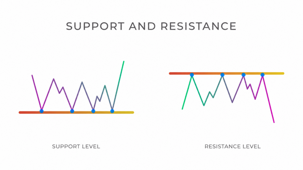
Support is a price area where Bitcoin tends to stop falling or bounce.
It is called support because buyers often appear around that level.
For example, if Bitcoin falls to $60,000 several times and bounces each time, traders may say $60,000 is a support level.
Support does not mean price cannot fall below that level. It only means buyers have previously defended that area.
What Is Resistance in Bitcoin Charts?
Resistance is a price area where Bitcoin tends to stop rising or pull back.
It is called resistance because sellers often appear around that level.
For example, if Bitcoin rises to $70,000 several times but fails to break above it, traders may call $70,000 a resistance level.
Resistance does not mean price cannot go higher. It only means sellers have previously been strong around that area.
Support and Resistance Are Zones, Not Perfect Lines
Beginners often draw support and resistance as exact lines.
But in real markets, they are better understood as zones.
Bitcoin may not bounce from the exact same price every time. It may move slightly above or below a level before reversing.
For example, if Bitcoin has bounced around $60,000 before, the real support zone may be between $59,500 and $60,500.
Think of support and resistance as areas, not magic numbers.
What Happens When Support Breaks?
When Bitcoin falls below support, that can be a bearish sign.
It may mean buyers failed to defend the level.
After support breaks, price may move lower to the next support area.
Sometimes, broken support becomes new resistance.
For example:
- Bitcoin had support at $60,000.
- Price breaks below $60,000.
- Later, Bitcoin tries to climb back above $60,000.
- Sellers appear around $60,000.
- The old support now acts as resistance.
What Happens When Resistance Breaks?
When Bitcoin breaks above resistance, that can be a bullish sign.
It may mean buyers are strong enough to push price higher.
After resistance breaks, price may move toward the next resistance area.
Sometimes, broken resistance becomes new support.
For example:
- Bitcoin had resistance at $70,000.
- Price breaks above $70,000.
- Later, Bitcoin pulls back to $70,000.
- Buyers defend the level.
- The old resistance now acts as support.
What Is a Breakout?
A breakout happens when Bitcoin moves above resistance or below support.
There are two main types:
- Bullish breakout.
- Bearish breakout.
A bullish breakout happens when price breaks above resistance.
A bearish breakout happens when price breaks below support.
But not every breakout is real.
Some breakouts fail.
What Is a Fakeout?
A fakeout happens when Bitcoin appears to break a key level, but quickly reverses.
For example:
- Bitcoin rises above resistance.
- Many traders buy.
- Price quickly falls back below resistance.
- Buyers get trapped.
This is why beginners should not rely on price alone. Volume, candle close, and retests can help confirm whether a breakout is stronger.
Why the Candle Close Matters
A wick above resistance is not always a breakout.
A wick below support is not always a breakdown.
Many traders wait for a candle to close above resistance or below support.
A close shows that price managed to stay beyond the level until the end of that timeframe.
For example, a daily close above resistance is usually more meaningful than a quick 5-minute spike above it.
What Is Trading Volume?
Volume shows how much Bitcoin was traded during a specific period.
On most charts, volume appears as bars at the bottom.
High volume means many traders are participating.
Low volume means fewer traders are participating.
Volume helps confirm whether a price move has strength.
How to Read Bitcoin Volume
Volume gives context to price movement.
Here are simple examples:
- Price rises with high volume: buyers may be strong.
- Price rises with low volume: move may be weak.
- Price falls with high volume: sellers may be strong.
- Price falls with low volume: selling pressure may be fading.
- Breakout with high volume: stronger confirmation.
- Breakout with low volume: higher risk of fakeout.
Volume and Breakouts
A breakout is usually more convincing when volume increases.
Why?
Because it shows that many market participants are involved in the move.
For example, if Bitcoin breaks above resistance with strong volume, it may mean buyers are serious.
If Bitcoin breaks above resistance with weak volume, it may mean only a small group of traders pushed the price up temporarily.
What Is Market Structure?
Market structure is the pattern of highs and lows on a chart.
It helps you understand who is in control.
In an uptrend:
- Bitcoin makes higher highs.
- Bitcoin makes higher lows.
In a downtrend:
- Bitcoin makes lower highs.
- Bitcoin makes lower lows.
In a range:
- Bitcoin moves between support and resistance.
Market structure is one of the simplest and most powerful chart-reading tools.
What Are Higher Highs and Higher Lows?
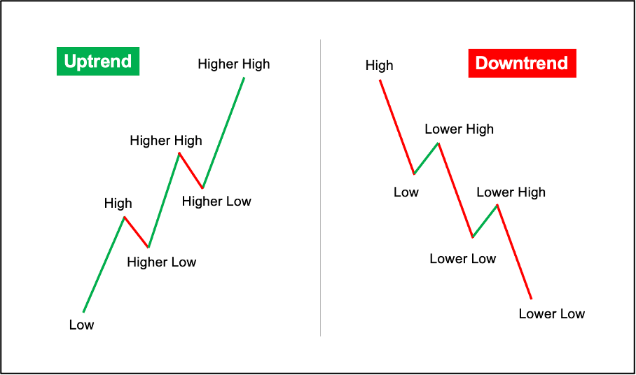
A higher high happens when Bitcoin makes a new peak above the previous peak.
A higher low happens when Bitcoin pulls back but stays above the previous low.
Together, they show an uptrend.
Example:
- Bitcoin rises to $65,000.
- Pulls back to $62,000.
- Rises to $68,000.
- Pulls back to $64,000.
This shows higher highs and higher lows.
Buyers are likely in control.
What Are Lower Highs and Lower Lows?
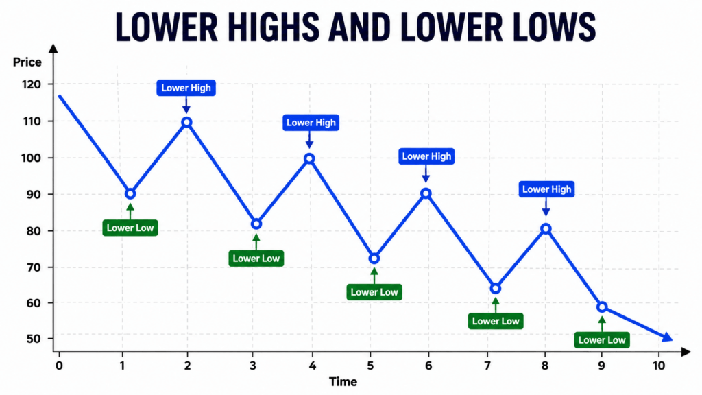
A lower high happens when Bitcoin bounces but fails to reach the previous peak.
A lower low happens when Bitcoin falls below the previous low.
Together, they show a downtrend.
Example:
- Bitcoin falls to $60,000.
- Bounces to $63,000.
- Falls to $58,000.
- Bounces to $61,000.
This shows lower highs and lower lows.
Sellers are likely in control.